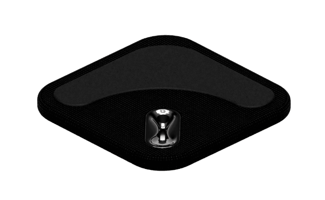
Womp: The Silent Alarm

A smart, haptic alarm clock for personalized, uninterrupted sleep

Role

Co-founder

Industry

Health & Wellness + Electronics

Duration

5 days

Slept through your alarm again? Womp womp.

Womp is a silent alarm clock that never misses. You in, or would you rather keep snoozing?

snoozethis.club

Brand Vision

A world where restful sleep is personalized and uninterrupted, empowering individuals to start their day refreshed and ready, without disturbing those around them.

Brand Mission

To revolutionize the sleep experience by designing smart, haptic solutions that respect shared spaces, while leveraging environmental insights to enhance sleep quality for users everywhere.

Values

  • Innovative Design: We prioritize creating products that blend functionality and comfort through thoughtful, user-centered design.

  • User-Centric Innovation: We are committed to solving real-world problems by keeping the user’s needs at the heart of our innovation process, ensuring our products enhance well-being.

  • Collaborative growth: We value cross-disciplinary collaboration and continuous learning, striving to push the boundaries of what’s possible in both technology and design.

  • Sustainability: We believe in creating sustainable products that contribute to a better quality of life without compromising the environment or the well-being of others.

Tone of Voice

  • Confident: We speak with authority and assurance, emphasizing our expertise in smart, personalized solutions that make a real difference in daily life.

  • Sarcastic: Oh, you need five alarms to wake up? Sure, that’s totally normal. But hey, why not try something that actually works? Womp is here to save you (and your roommates) from your morning struggles - you’re welcome.

  • Innovative: We communicate with an edge of creativity and forward-thinking, showcasing how our products break the mold and set new standards.

  • Practical: Our language is clear and straightforward, making technology accessible and highlighting the tangible benefits of our products.

a cell phone on a white block
two cell phones on a gray surface

Color Palette

Womp's color palette blends earthy tones with vibrant accents to reflect the brand's core values of trust, reliability, and modern energy, perfectly aligning with the purpose of Womp —a smart, haptic alarm designed to enhance your sleep quality.

The muted greens, purples, and warm neutrals evoke stability and a connection to nature, reinforcing Womp's authenticity and commitment to creating a calming, restful environment. Meanwhile, the bold red and bright blue introduce a dynamic contrast, symbolizing the brand's innovative and forward-thinking approach to sleep technology.

This balanced palette effectively communicates Womp's blend of dependability and contemporary vibrancy, making it resonate with a modern, discerning audience seeking both relaxation and cutting-edge solutions for better sleep.

Visual Identity

Our brand's commitment to a restful, personalized sleep experience is visually translated into a clean, minimalistic, and dream-like identity that feels almost cinematic.

The design language embraces simplicity, using soft color palettes and airy, open spaces to evoke a sense of calm and tranquility. Minimalistic elements are thoughtfully combined with fluid, organic shapes and subtle gradients, reminiscent of a peaceful slumber or a serene morning awakening. Each visual choice, from the gentle curves to the unobtrusive textures, creates a narrative that feels like a tranquil film scene, drawing viewers into the serene world of restful sleep we strive to create.

This cinematic approach reflects our focus on user-centered design and innovation, reinforcing our mission to enhance well-being through clarity and comfort. The dream-like aesthetic is carefully curated to make every interaction with our brand feel like a soothing, refreshing experience, mirroring the calmness and renewal that quality sleep brings. By visually presenting ourselves with this artful blend of simplicity and sophistication, we offer an engaging yet understated experience that makes our commitment to uninterrupted, personalized sleep come alive.

a cell phone leaning on a ledge
a pair of cell phones on a concrete block
a cell phone with a yellow rectangular screen

Reflections

Working on this project deepened my understanding of how visual identity shapes a brand's presence and impact. I learned the importance of crafting a cohesive aesthetic that not only aligns with the brand's mission but also evokes the desired emotions in its audience. This experience taught me how every design element—from color palettes to typography—plays a crucial role in telling a brand's story and creating a memorable user experience. I realized that a thoughtful, visually engaging identity can elevate a brand, making it both distinct and resonant.

Other projects

Maya Parthasarathy

Made with 🤍 by Maya

Maya Parthasarathy

Made with 🤍 by Maya

Maya Parthasarathy

Made with 🤍 by Maya